Ui/ux feedback
First of all, thank you SO much for creating an app for scritches! It’s so nice and helpful to be able to access from a dedicated mobile space at any time.
After exploring the app, I wanted to share some feedback and a rough sketch to go along with it that I hope can be helpful. Here’s a general breakdown:
Navigation bar (Home / Inbox / Calendar / More) instead of the side menu to make core actions quicker to access vs the hamburger menu
Home Screen — a quick glance dashboard instead of landing straight into the full calendar grid
Calendar— an organized space to view booked sittings and also block off days that are not available and/or maybe even days certain sitters are available if some are and some aren’t. Click on the days that are scheduled to view details such as timing, etc
Dedicated inbox tab — i know messaging is currently in the works and once it’s ready, it’d be helpful to have quick access to it
Sitter profiles — more in depth bio, services, experience, notes, etc
Business settings/extras — a place for Clients, Services, Forms, Docs, Reviews, Staff under one icon so they're out of primary nav but still easy to find
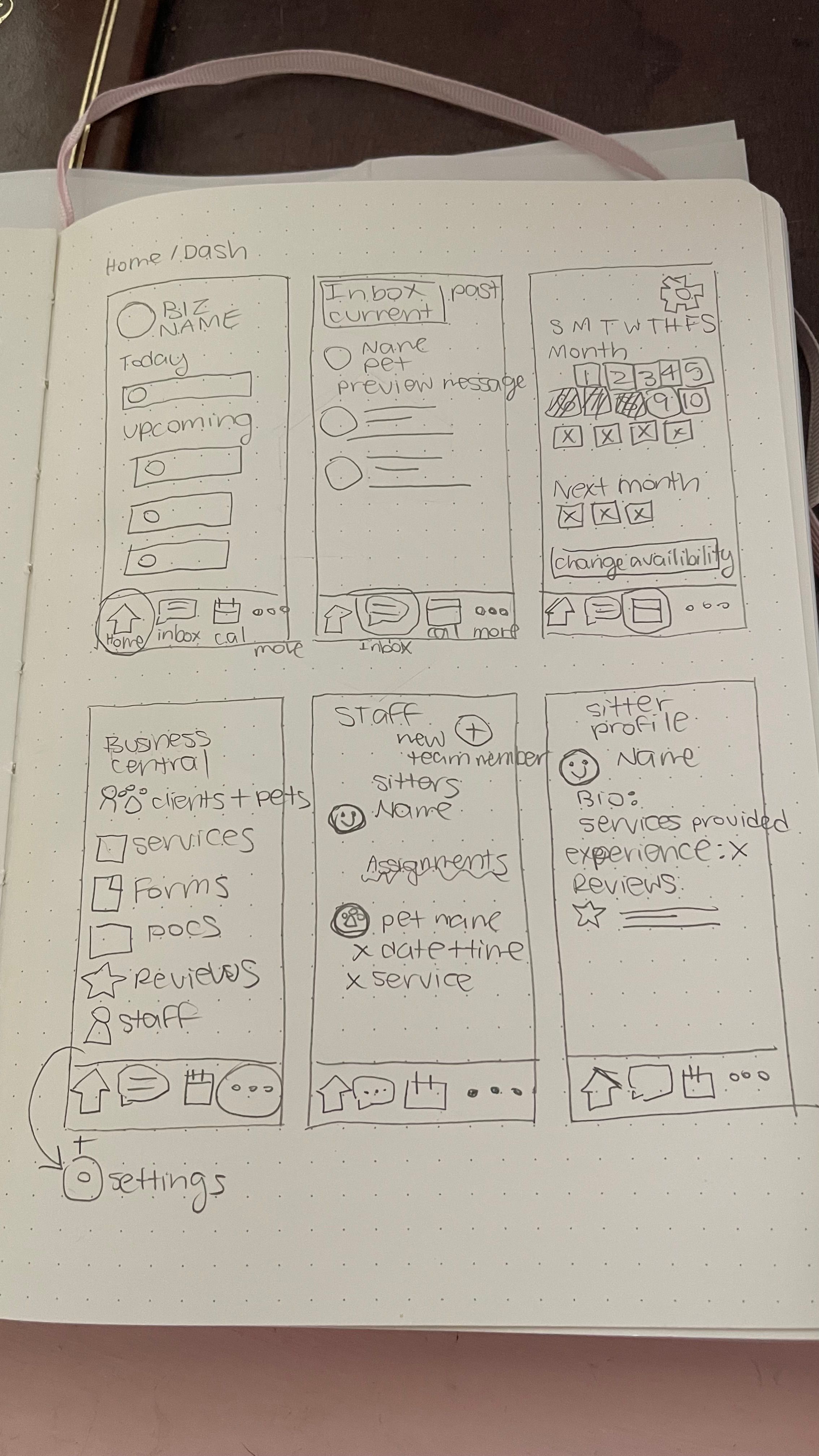
Attached is a photo of a general sketch and I’d be happy to elaborate on any of it if useful! Again, thank you so much for working on a dedicated app! Your work is appreciated 🫶🐾
Log in to comment and vote
Comments3
Lucas Steflor
Sep 4
Hey @Kristina Bowman , I absolutely love the sketches and suggestions you sent! There are lots of little details in them that improve on the existing app, and I think it gets even closer to an experience that an on-the-go sitter/walker would expect and appreciate. I especially like the new ordering of nav items.
I’ve been back-and-forth on whether or not to create a traditional dashboard; it’s something I want to get right if I do. I’ll keep thinking on this 🤔
I’m going to keep this post close and will definitely reference it as I continue to improve the mobile experience. I’ll be sure to reach out if I have any questions for ya (and of course let you know if any of your suggestions land).
Thanks a ton for the kind words on Scritches, and for taking the time to send this over 🙂 .
Kristina Bowman
Sep 7
Of course! Scritches has helped a lot with organization and I appreciate your transparency on the upgrades and process :) I have some background in ui/ux design and understand that the backend portion is MUCH easier said than done from some friends who are software developers 😅
I live in Silicon Valley so if you need some recommendations for some developers to help out, I have a ton of referrals available lol
Lucas Steflor
Sep 9
The background definitely shows! UI/UX is way more fun IMO, but unfortunately the backend is needed as well 🙄
And thanks for the rec offer, I’ll reach out if things ever expand to that!